

advanced analytics for everyone
Our Analytical Maps & Reports are tailored to deliver detailed insights and clear visual representations. Designed for accuracy and ease of use, these tools help you interpret data effectively and make well-informed decisions.

Observation Maps
Our Observation Maps show the locations and details of recorded observations, such as wildlife sightings or environmental changes, as points or a heat map. Orange highlights areas with many records, while blue shows areas with fewer. It helps visualise data patterns and trends for better analysis and decision-making.
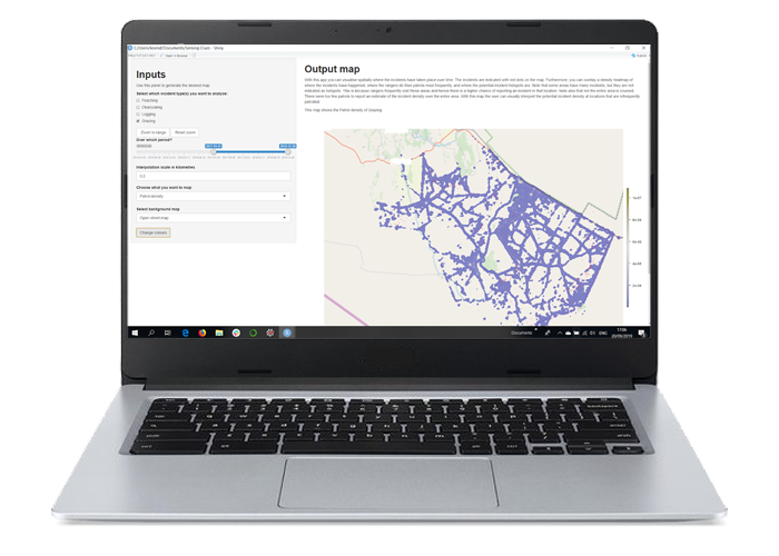
Patrol Maps
Our Patrol Maps visually display the routes and areas covered by different types of patrols, such as foot, vehicle, snare-sweep patrols, or any combination of these. They help track patrol activities, monitor coverage, and plan future patrols.

Likelihood Maps
Our Likelihood Maps visualise the probability of an event or condition across different areas. We use colours to show varying likelihoods: orange indicates high probability, while black represents low probability.
Observation Reports

Our Observation reports offer overviews of all collected data, allowing you to filter by agent, month, administrative region, and more. You can also download the data into a spreadsheet for further analysis.

Patrol Reports
Our Patrol Reports provide detailed information on patrol activities, including routes, coverage, and observations. It allows you to analyse data by agent, month, and other criteria. You can also download the data for further processing in tools like QGIS.

Community Work Reports
Our Community Work Report summarise the impact of community activities, detailing beneficiaries reached, activities organised, and subjects addressed. It allows for analysis by gender, administrative region, month, and more. You can also download the data into a spreadsheet for further review.